BURT BLEE
BURT BLEE BRANDING
Local law firm Burt, Blee, Dixon, Sutton & Bloom has been a part of the Fort Wayne community since the 1920s. Although their rich history is an important part of their identity, through the years they’ve evolved to offer more progressive strategies. This mix of traditional and modern was something they had mastered culturally, but didn’t come across in their old-fashioned brand. By revamping the firm’s look, feel and messaging, we created a new brand that reintroduced them to the market and positioned them as a mix of both worlds — blending the old with the new to represent where they had come from and, more importantly, where they were going.
DELIVERABLES
- Branding
- Photography
- Web Design
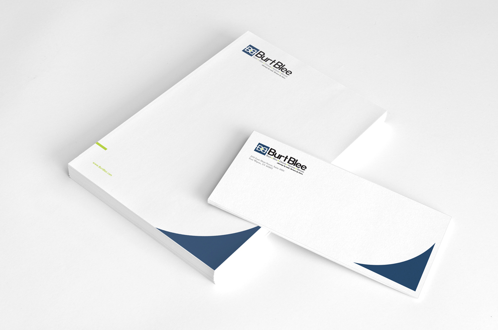
- Print Collateral


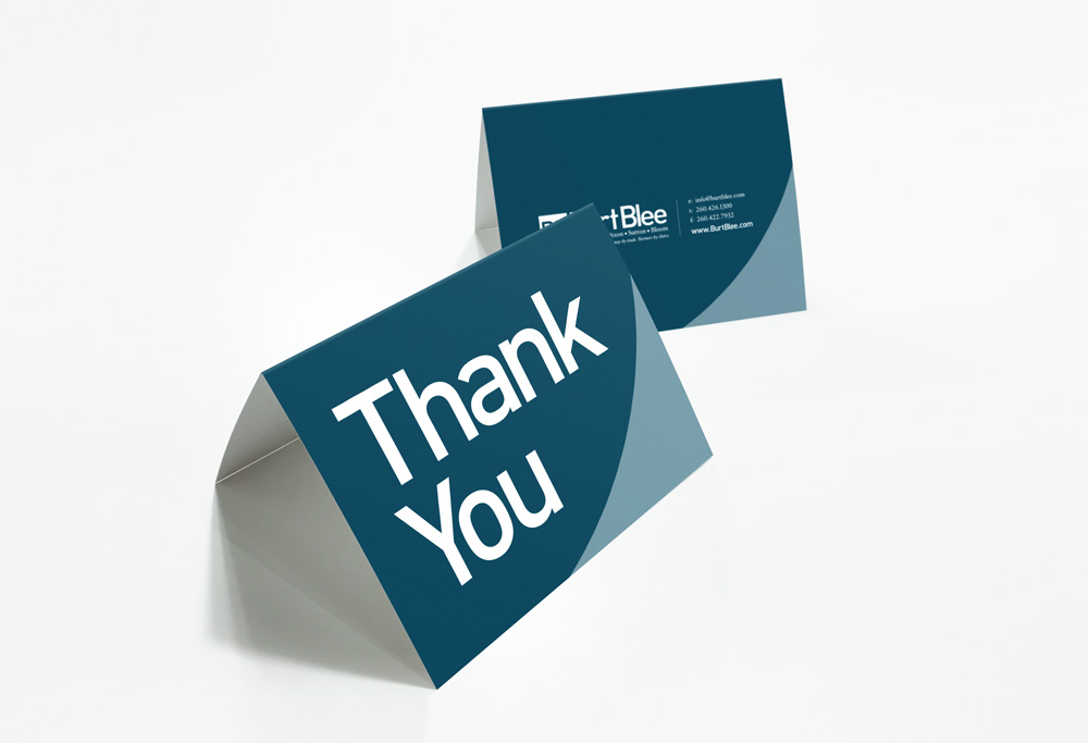
the details:
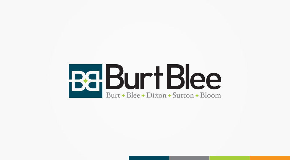
- A shortened name, Burt Blee, gives them a more contemporary identity (and is what their clients had already been calling them for years!)
- A logo with two modern Bs facing each other creates a star or pinpoint in the negative space — representing their dedication to putting the client at the center of their practice
- By pairing a bold main typeface with a more traditional serif, the brand is modernized but still stays true to their established and trusted legacy
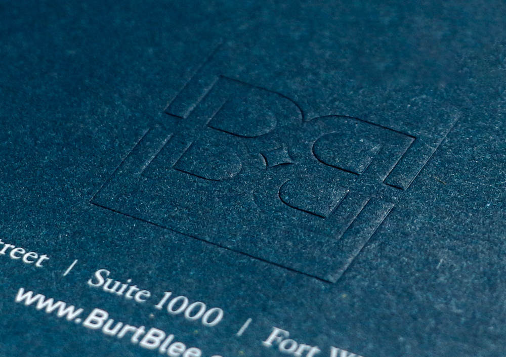
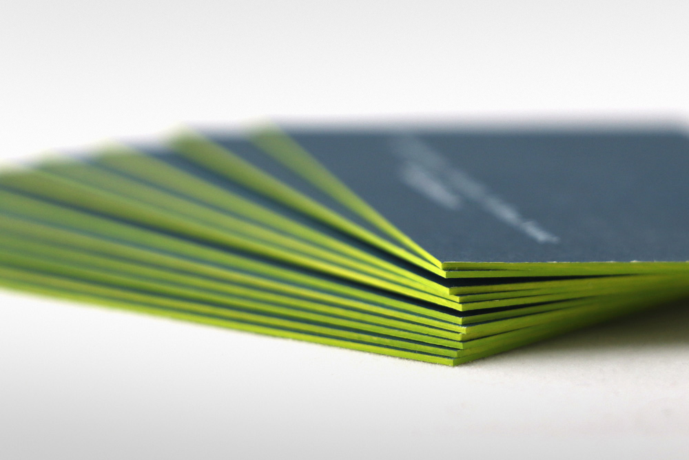
- Blind embossed business cards with hand-painted edges are unique, memorable and stand out in an endless pile of ordinary cards
- A fresh, progressive website design positions Burt Blee as a forward-thinking leader in our region